 |
| Click to Enlarge |
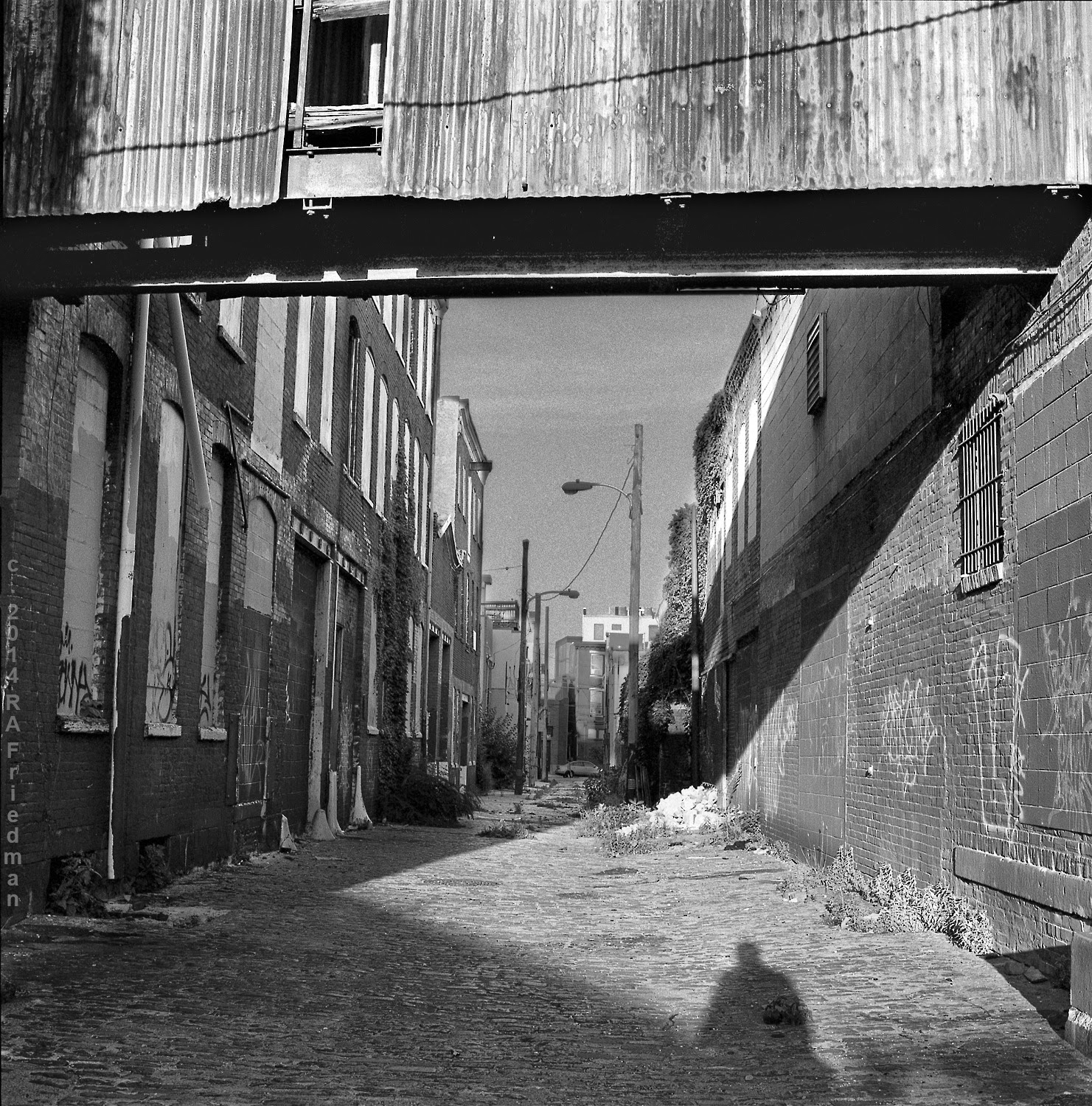
Location:
Wallace Street, Northern Liberties
Camera:
Hasselblad 500cm, 80mm CF T
Film: Tri-X
ISO: 320
Develop:
HC 110
Image
size: Full frame, approx. 23” x 23” at 300 dpi
What
I’m eating: More fermented foods
What
I’m reading: Blogs about Russian/East German medium format cameras and lenses.
Where
I yearn to be: Stalking street cats in Sapporo.
Biggest
fail: Facebook forever deletes my fan page and 1000 + followers
Best
bookend: Pulling the plug on my Facebook account
Biggest
win: Successfully grafting a CB70, SX-70 type, instant film back to a 4x5
camera using nothing more than tape and a few film can tops.
Most
immediate creative desire: A serious rotation of the eyeball


